Satellite Beach
Description:
This project was an interior refurbishment project in Satellite Beach, Florida. As I sat down with my clients to identify their goals and budgetary restraints, design ideas started to flow while frantically sketching out initial design ideas with my clients. This project being the first real-world application of my design skills, it was fantastic to build a relationship and help a client’s dream be realized. There were some budgetary restraints, but the budget was flexible, and the decision was made to focus on the great room as the space of emphasis while saving money in other places. The client had an idea of how space might be laid out in plan but didn’t have much of an idea of materiality or what style they wanted. Being there vacation home, they wanted something minimal, so there isn’t a lot of stuff to move if they end up selling the unit. The main goals that were identified were to keep the design as minimal as possible and to have the design focus on people and relationships.
Great Room
Before
The opportunities in the great room were endless being oversized. The focus was to create an inviting space with many different functions intertwined. The fans were a bit of an eye soar and clearly needed to be replaced when defining a drastically different style and color pallette.
After
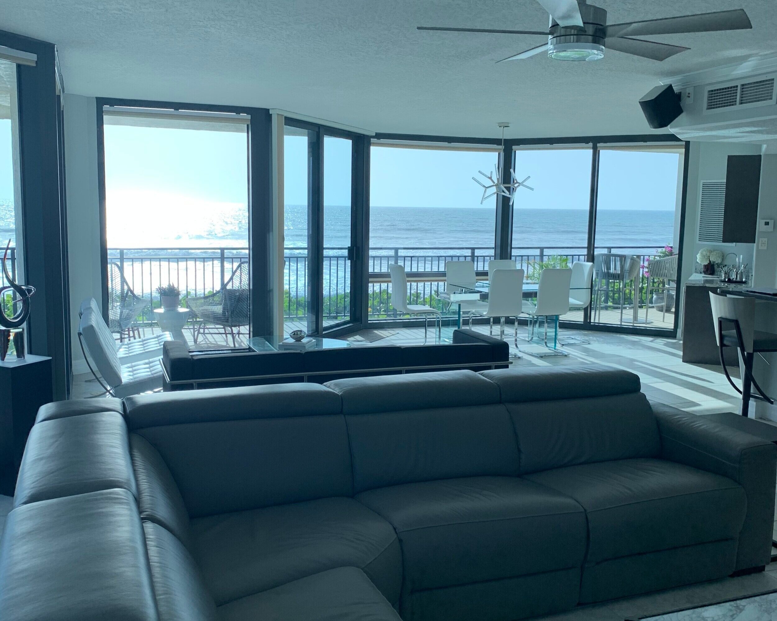
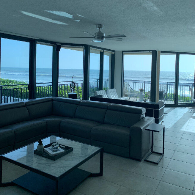
The design created a central living room with a formal dining area and a secondary living room. The primary living room is a less formal relaxation area made for late movie nights. In contrast, the second living area is used as an elevated area to entertain and catch some ocean views.
Kitchen
Before
The kitchen itself had some aesthetic updates to be made but the main focus was bringing in a cooking vent and how to handle the crown molding on the cabinetry.
After
The kitchen update was minimal by adding a new faucet, vent, and backdrop tiling. The microwave was moved above the oven to conserve usable space, and the cabinetry was replaced with brand new modern doors.
Dinning
Before
The client wanted a formal dining space included in the great room layout. There is a nook like space with full wall windows facing the oceanfront on the great room's edge.
After
The Dining room table was made as to the focus of the space. The centerpiece is a Quasar extension dining table that can expand in size to seat more guests. Utilizing transformative furniture can conserve space when in a tight area.
Master Bedroom
Before
The bedroom being a large room, the client wanted to utilize the space in front of the bed. The client also wanted to incorporate some wood in this room to give it more of a resort-like feeling.
After
The room had extra space in front of the bed; the client wanted the bike to the left of the bed and wanted to balance the room on the right. The Eames Lounge Chair on the bed's request balances the room and gives the users a place to relax in a private area.
Bathroom
After
The powder room's finish came together nicely with few materials and kept the clean design emphasized in an excellent place. As the most public bathroom for guests, this room was essential to show the quality of design and finish level. Almost everything in the bathroom was replaced with new materials and paint except for the room's tiling itself.
Before
The powder room is placed between the office space, and entry sequence became an eye soar with dated fixtures and amenities. Early on in goal setting, the powder room focused but didn’t fit into the original budget. Luckily we were able to save money other places to contribute more to the bathroom.
Products
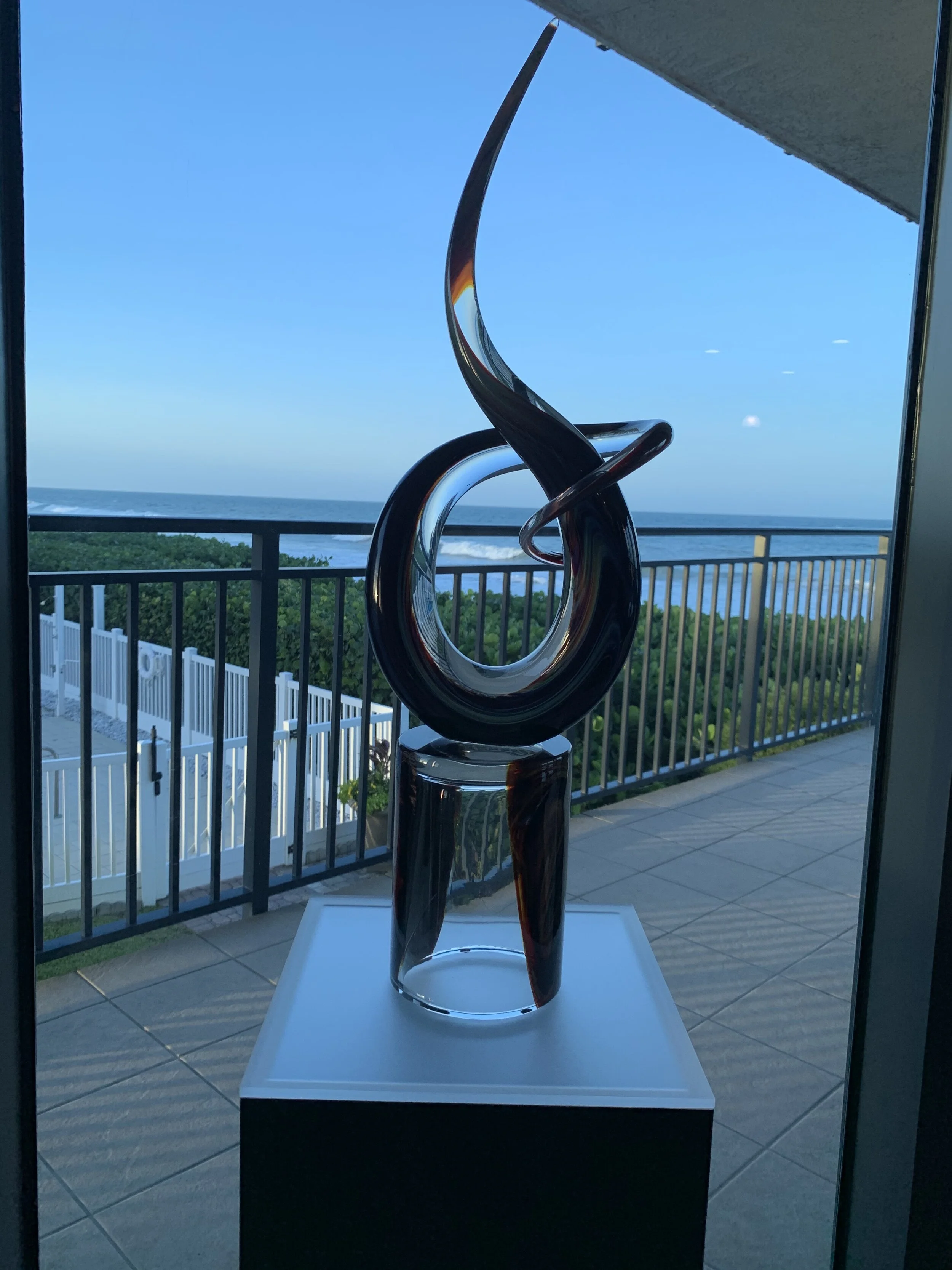
“Love Knot” Murano Glass
The Love Knot is meant to be the symbol of love. The sculpture is made from clear glass and chalcedony, made by hand.
Eames Lounge
The Eames Lounge Chair and ottoman are furnishings made of molded plywood and leather, designed by Charles and Ray Eames for the Herman Miller furniture company. They are officially titled Eames Lounge and Ottoman and were released in 1956 after years of development by designers.
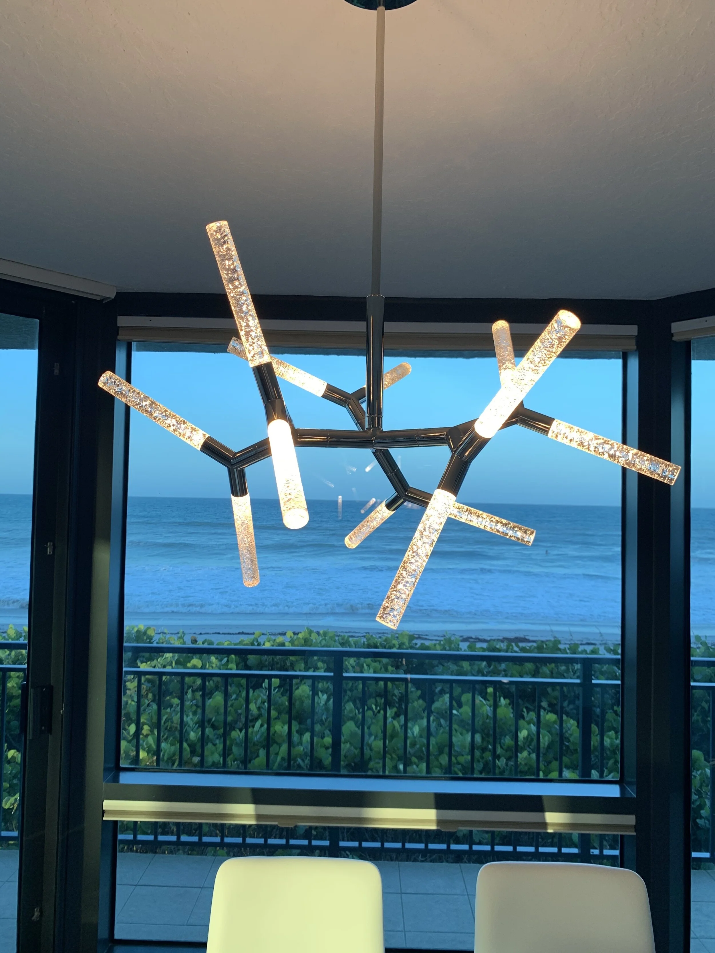
Modern Forms Kryptonite
This intrinsic modern chandelier expresses the overall design of the project. The construction is clever using a stepped circular canopy by a telescoping stem.
LC3 Grand Modele
Grand Confort is a cube-shaped high armchair, whose leather cushions are held in a chrome-plated steel corset. It was designed as a modernist response to the traditional club chair in 1928 by a team of three: Le Corbusier; his cousin and colleague Pierre Jeanneret; and Charlotte Perriand.
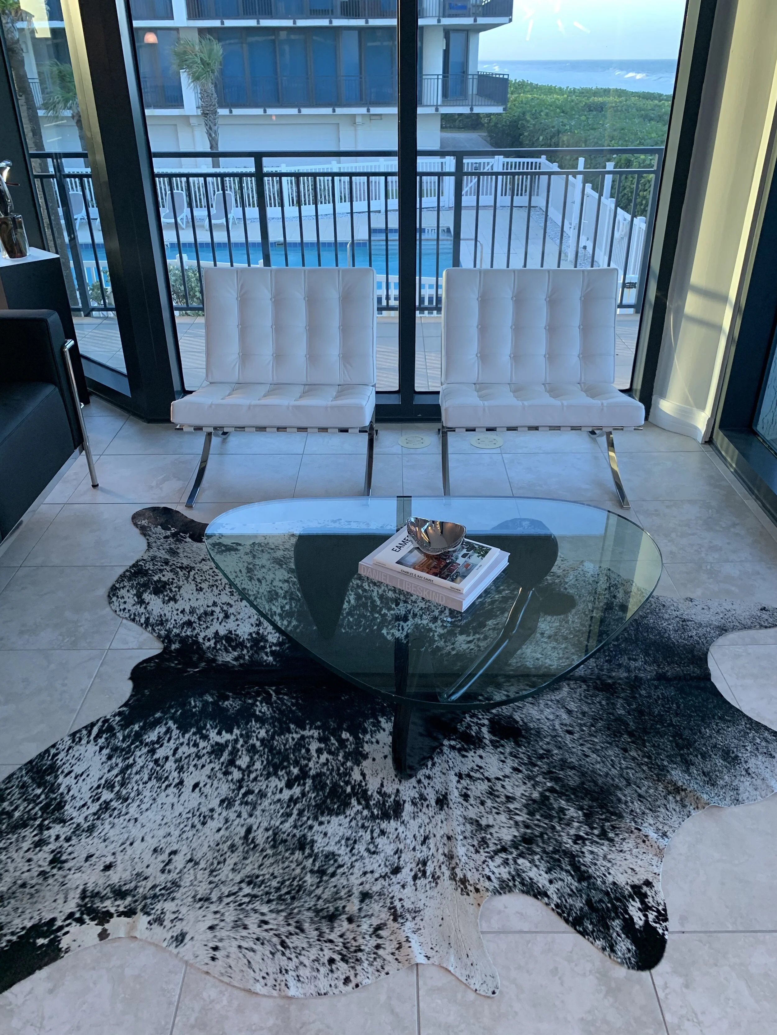
Noguchi Table
Constructed from only three pieces. The glass top piece rests on two curved wooden legs creating an iconic piece of mid-century modern furniture.
Barcelona Chair
The Barcelona chair is a chair designed by Mies Van De Rohe and Lilley Reich, for the German Pavillion at the International Exposition of 1929, hosted by Barcelona, Catalonia, Spain. The chair was first used in Villa Tugendhat, a private residence, designed by Mies in Brno (Czech Republic)
Overview
1. Budget
This project taught me a lot about managing a client’s budget and managing your optimism regarding what you can do within the budgetary restraints. Architects and Designers have a fiscal responsibility to the client before anything else. I also learned to account for the Subcontractor's time and created a surplus budget.
2. Schedule Management
Learning how to maximize your own time while balancing your client’s and subcontractor's time is essential to high productivity. I had to have an extensive schedule to match up when my clients would be home and when specific subcontractors would show up.
